![[Instock] Macross65 Keyboard](http://qwertyqop.com/cdn/shop/files/irlpic.webp?v=1741416837&width={width})
![[Instock] Macross65 Keyboard](http://qwertyqop.com/cdn/shop/files/irlpic.webp?v=1741416837)
![[Instock] Macross65 Keyboard](http://qwertyqop.com/cdn/shop/files/irlpic1.webp?v=1741416837&width={width})
![[Instock] Macross65 Keyboard](http://qwertyqop.com/cdn/shop/files/irlpic1.webp?v=1741416837)
![[Instock] Macross65 Keyboard](http://qwertyqop.com/cdn/shop/files/irlpic2.webp?v=1741416838&width={width})
![[Instock] Macross65 Keyboard](http://qwertyqop.com/cdn/shop/files/irlpic2.webp?v=1741416838)
![[Instock] Macross65 Keyboard](http://qwertyqop.com/cdn/shop/files/irlpic3.webp?v=1741416837&width={width})
![[Instock] Macross65 Keyboard](http://qwertyqop.com/cdn/shop/files/irlpic3.webp?v=1741416837)
![[Instock] Macross65 Keyboard](http://qwertyqop.com/cdn/shop/files/03.Darth_Vader_7d52278f-c413-48b1-83df-7fc26eb43c3d.jpg?v=1741417488&width={width})
![[Instock] Macross65 Keyboard](http://qwertyqop.com/cdn/shop/files/03.Darth_Vader_7d52278f-c413-48b1-83df-7fc26eb43c3d.jpg?v=1741417488)
![[Instock] Macross65 Keyboard](http://qwertyqop.com/cdn/shop/files/08.Concrete.jpg?v=1741417473&width={width})
![[Instock] Macross65 Keyboard](http://qwertyqop.com/cdn/shop/files/08.Concrete.jpg?v=1741417473)
![[Instock] Macross65 Keyboard](http://qwertyqop.com/cdn/shop/files/09.Gravel.jpg?v=1741417478&width={width})
![[Instock] Macross65 Keyboard](http://qwertyqop.com/cdn/shop/files/09.Gravel.jpg?v=1741417478)
![[Instock] Macross65 Keyboard](http://qwertyqop.com/cdn/shop/files/01.Quick_Silver_1d0678e7-38f1-4089-9924-b9d255c9aa04.jpg?v=1741417614&width={width})
![[Instock] Macross65 Keyboard](http://qwertyqop.com/cdn/shop/files/01.Quick_Silver_1d0678e7-38f1-4089-9924-b9d255c9aa04.jpg?v=1741417614)
![[Instock] Macross65 Keyboard](http://qwertyqop.com/cdn/shop/files/02.Top_gun_5f416328-66c3-4319-8037-00ecf698e225.jpg?v=1741417616&width={width})
![[Instock] Macross65 Keyboard](http://qwertyqop.com/cdn/shop/files/02.Top_gun_5f416328-66c3-4319-8037-00ecf698e225.jpg?v=1741417616)
![[Instock] Macross65 Keyboard](http://qwertyqop.com/cdn/shop/files/04.Peach_Pink_195deb1d-2a39-470e-bcaf-a163cb8da68f.jpg?v=1741417623&width={width})
![[Instock] Macross65 Keyboard](http://qwertyqop.com/cdn/shop/files/04.Peach_Pink_195deb1d-2a39-470e-bcaf-a163cb8da68f.jpg?v=1741417623)
![[Instock] Macross65 Keyboard](http://qwertyqop.com/cdn/shop/files/05.Iceberg_5fbe5bb0-9af9-4fab-92bf-2c4a0b88b38d.jpg?v=1741417625&width={width})
![[Instock] Macross65 Keyboard](http://qwertyqop.com/cdn/shop/files/05.Iceberg_5fbe5bb0-9af9-4fab-92bf-2c4a0b88b38d.jpg?v=1741417625)
![[Instock] Macross65 Keyboard](http://qwertyqop.com/cdn/shop/files/06.Mecha-01_9dc72250-3160-4ade-b1cf-183588b83726.jpg?v=1741417629&width={width})
![[Instock] Macross65 Keyboard](http://qwertyqop.com/cdn/shop/files/06.Mecha-01_9dc72250-3160-4ade-b1cf-183588b83726.jpg?v=1741417629)
![[Instock] Macross65 Keyboard](http://qwertyqop.com/cdn/shop/files/07.Tyraels_3d789b05-ac42-445f-b468-f02e6359e252.jpg?v=1741417634&width={width})
![[Instock] Macross65 Keyboard](http://qwertyqop.com/cdn/shop/files/07.Tyraels_3d789b05-ac42-445f-b468-f02e6359e252.jpg?v=1741417634)
![[Instock] Macross65 Keyboard](http://qwertyqop.com/cdn/shop/files/10.Bruce_Lee_31c875e9-30c6-493b-98d7-3e4ca97eabeb.jpg?v=1741417638&width={width})
![[Instock] Macross65 Keyboard](http://qwertyqop.com/cdn/shop/files/10.Bruce_Lee_31c875e9-30c6-493b-98d7-3e4ca97eabeb.jpg?v=1741417638)
![[Instock] Macross65 Keyboard](http://qwertyqop.com/cdn/shop/files/11.Storm_16871921-3cad-439c-be19-62cfce6bd341.jpg?v=1741417639&width={width})
![[Instock] Macross65 Keyboard](http://qwertyqop.com/cdn/shop/files/11.Storm_16871921-3cad-439c-be19-62cfce6bd341.jpg?v=1741417639)
![[Instock] Macross65 Keyboard](http://qwertyqop.com/cdn/shop/files/12.Khaki_dd453c5a-ded7-46fc-ae25-2bf346e1b34d.jpg?v=1741417643&width={width})
![[Instock] Macross65 Keyboard](http://qwertyqop.com/cdn/shop/files/12.Khaki_dd453c5a-ded7-46fc-ae25-2bf346e1b34d.jpg?v=1741417643)
Kit includes PCB and Plate
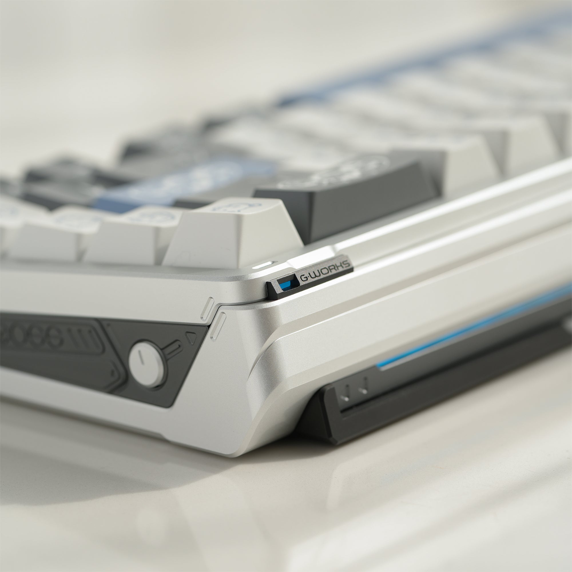
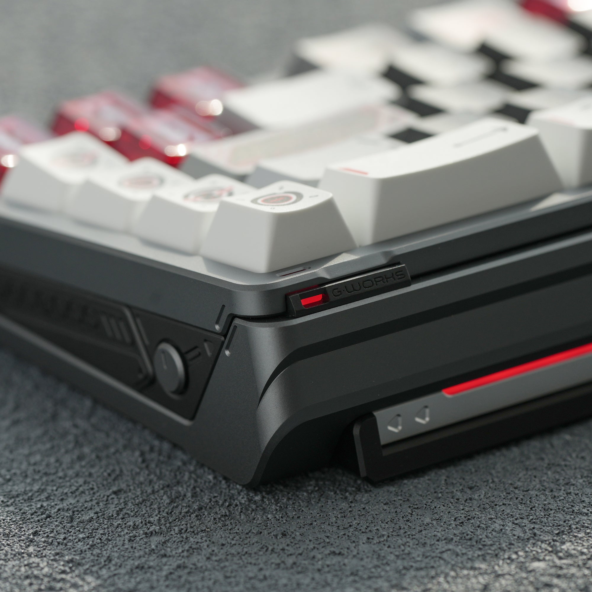
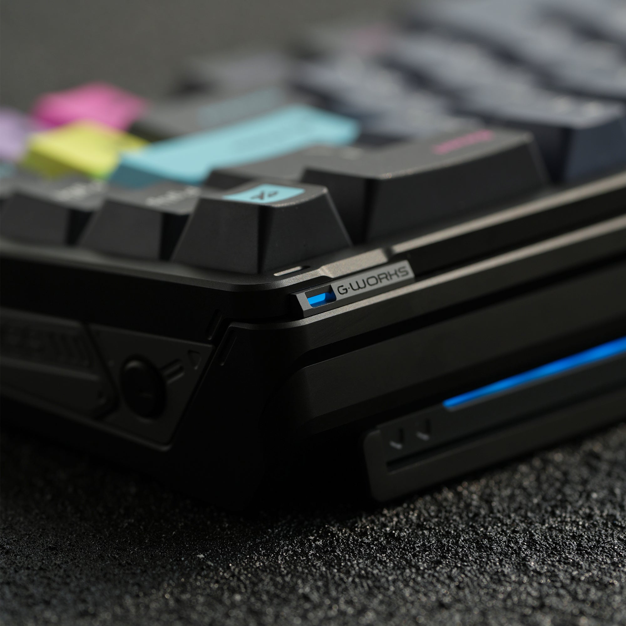
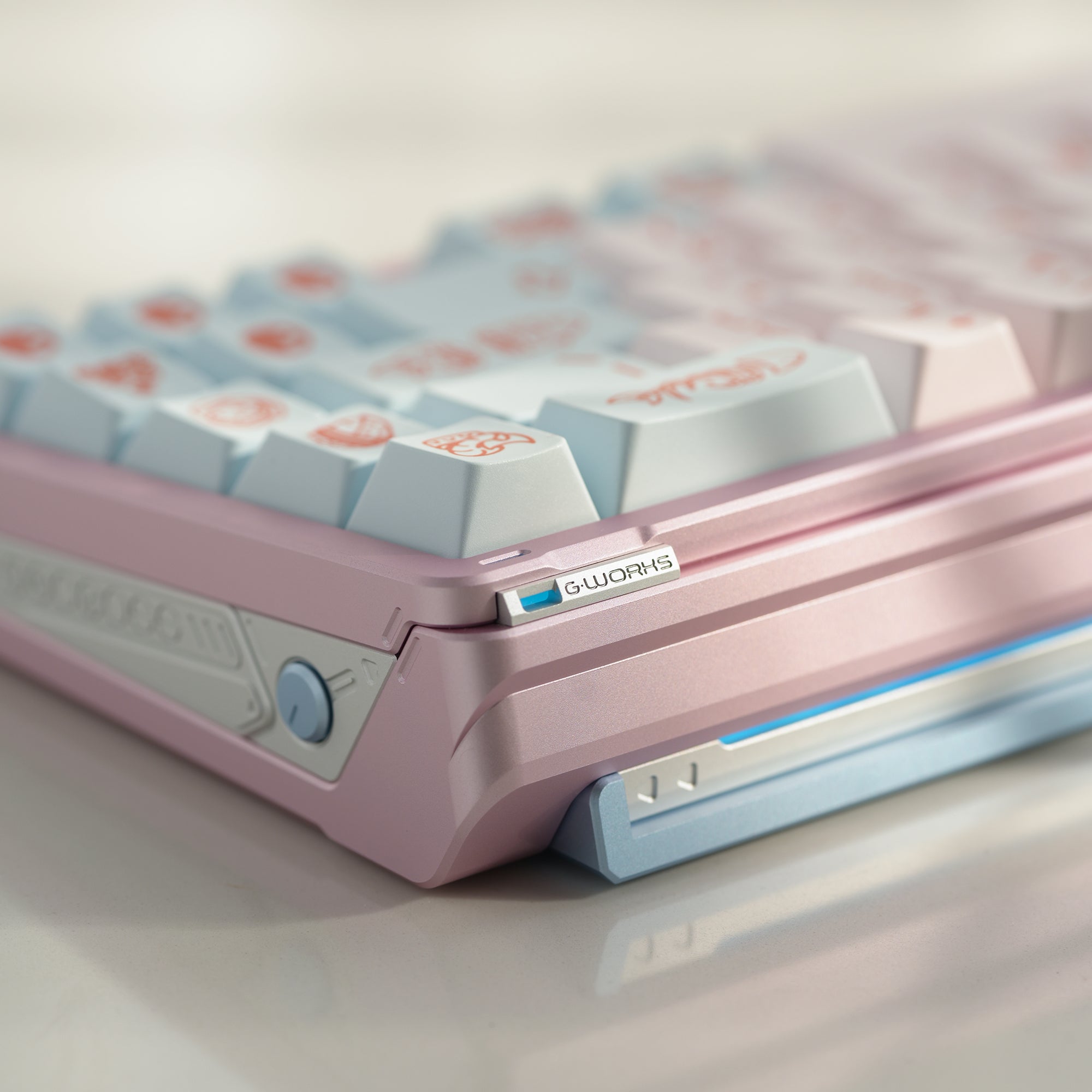
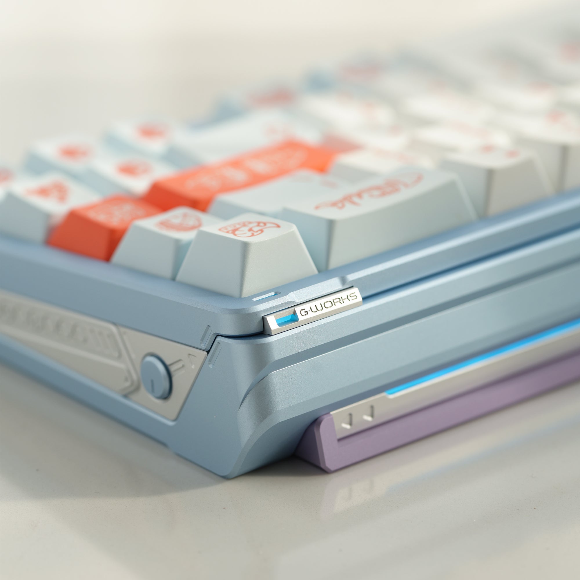
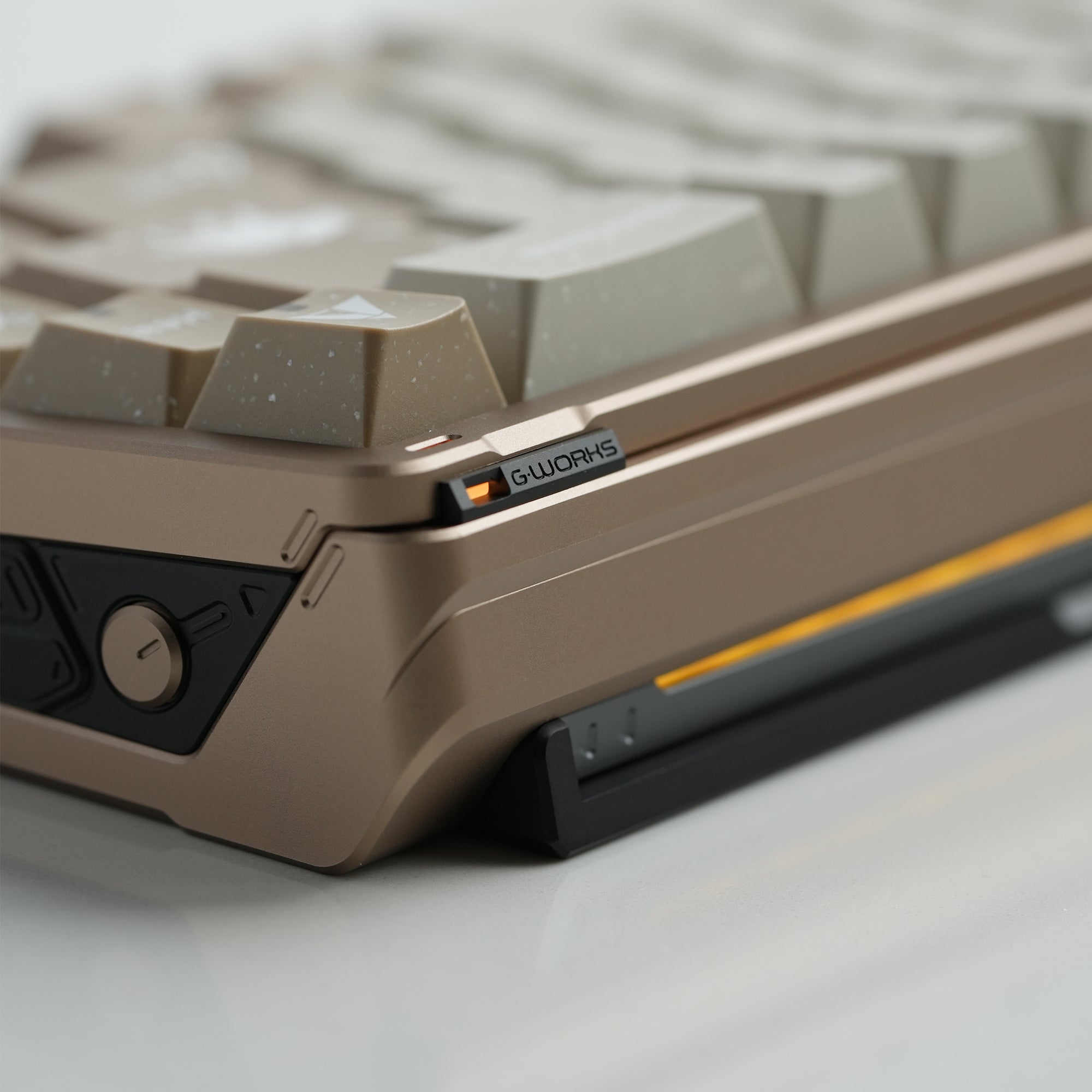
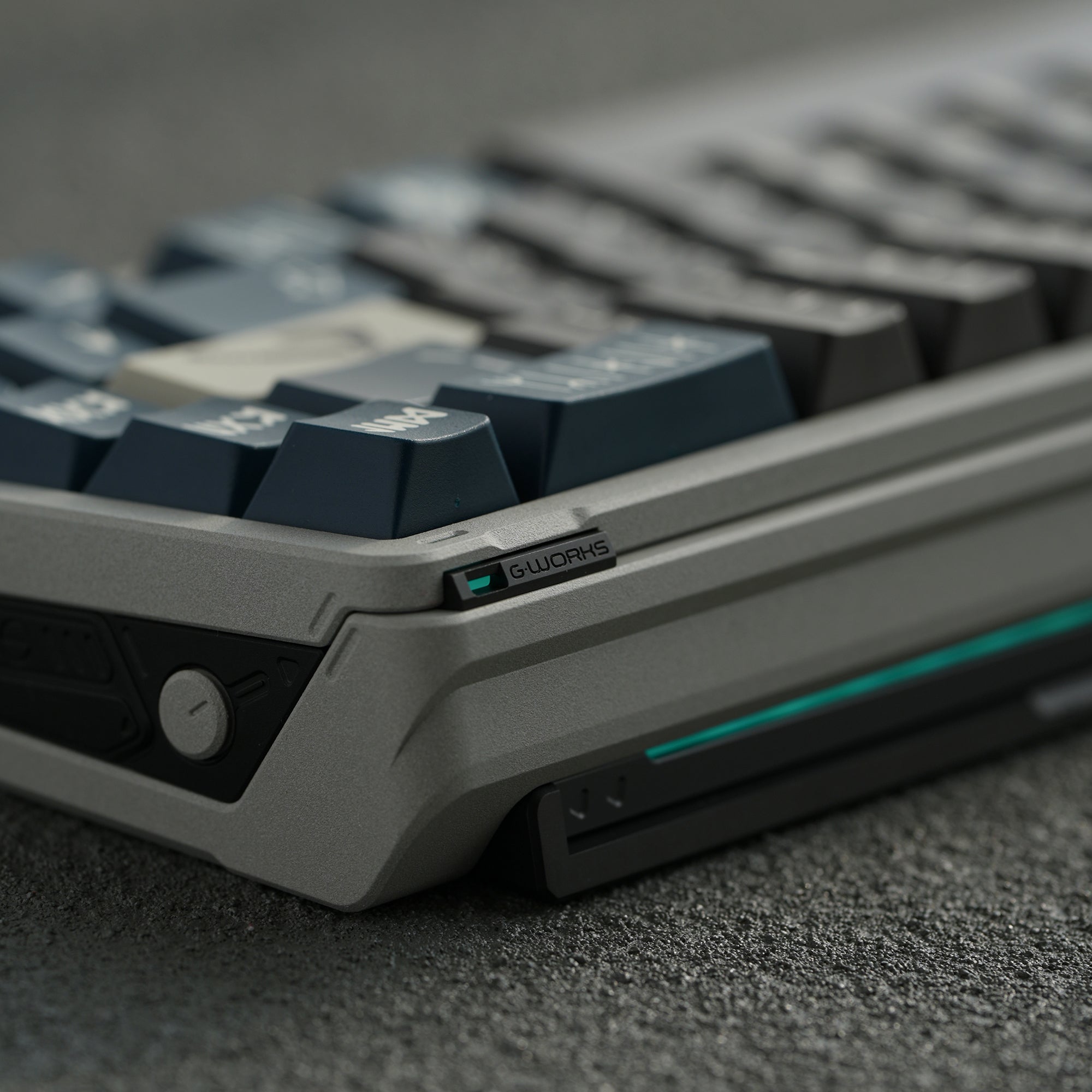
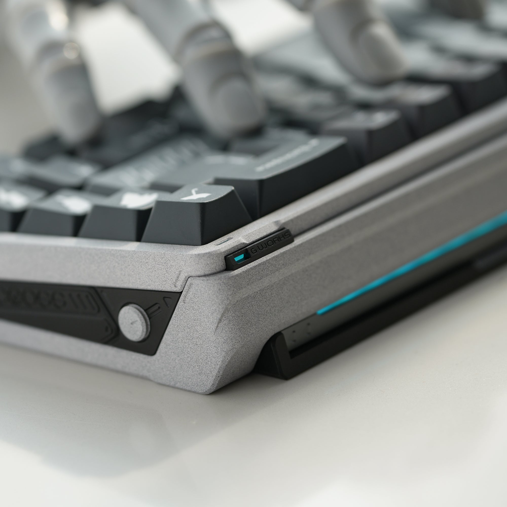
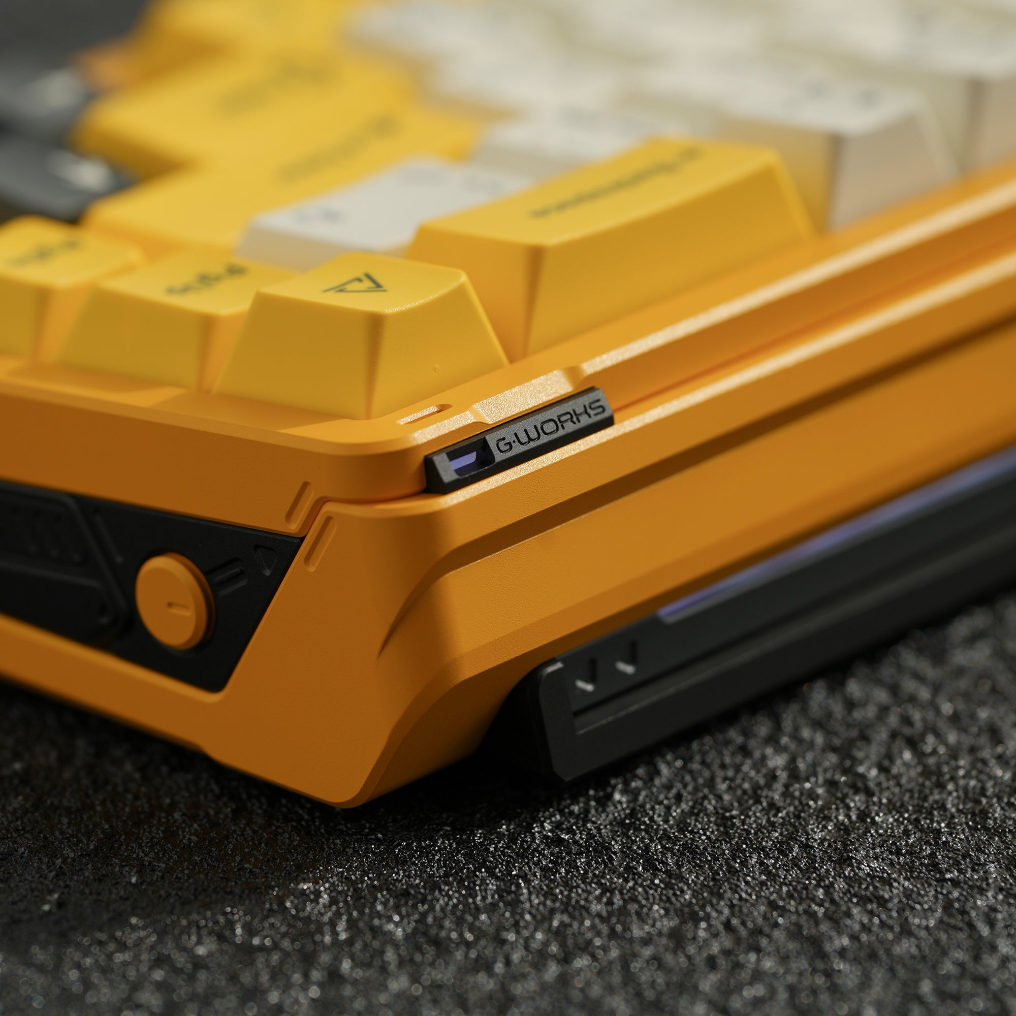
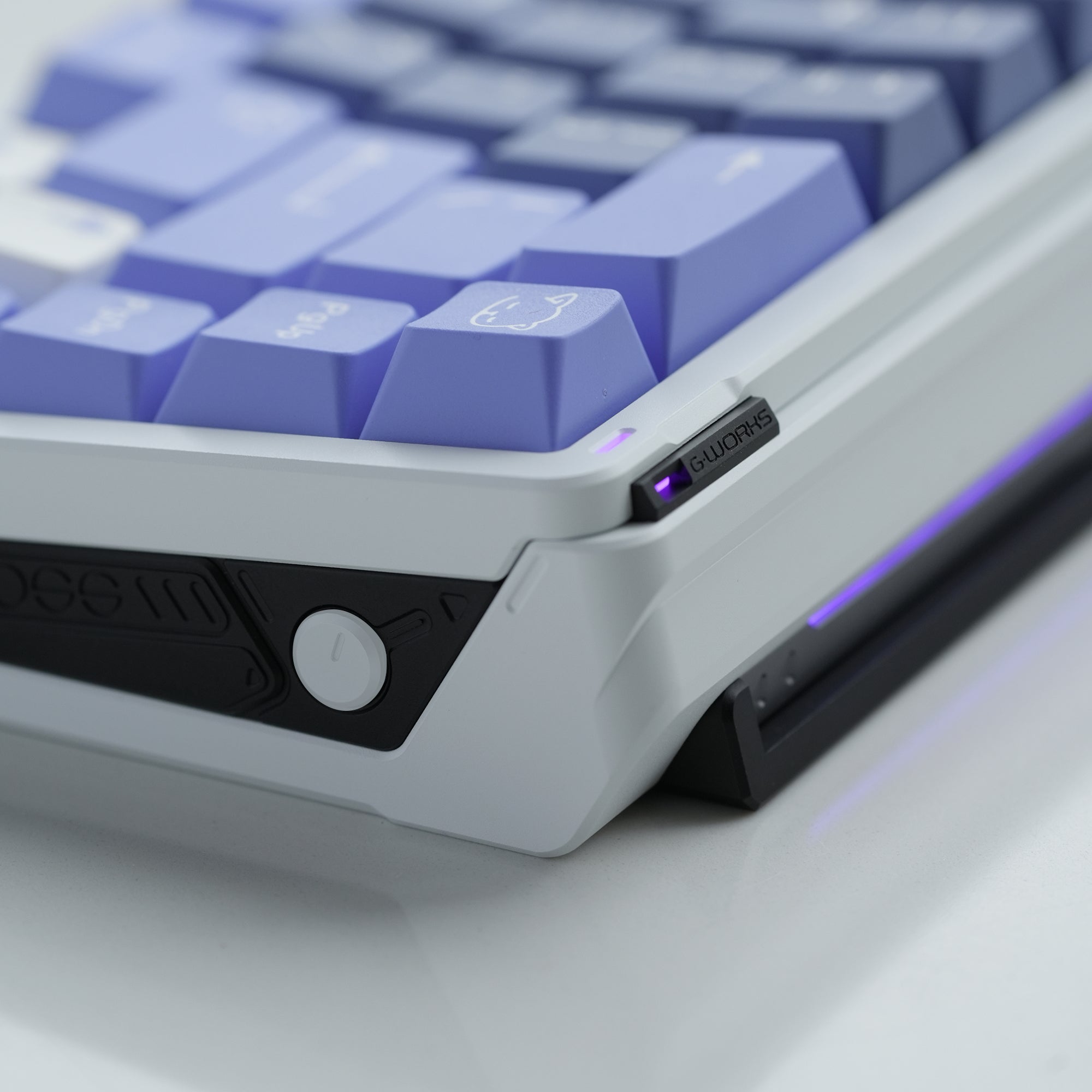
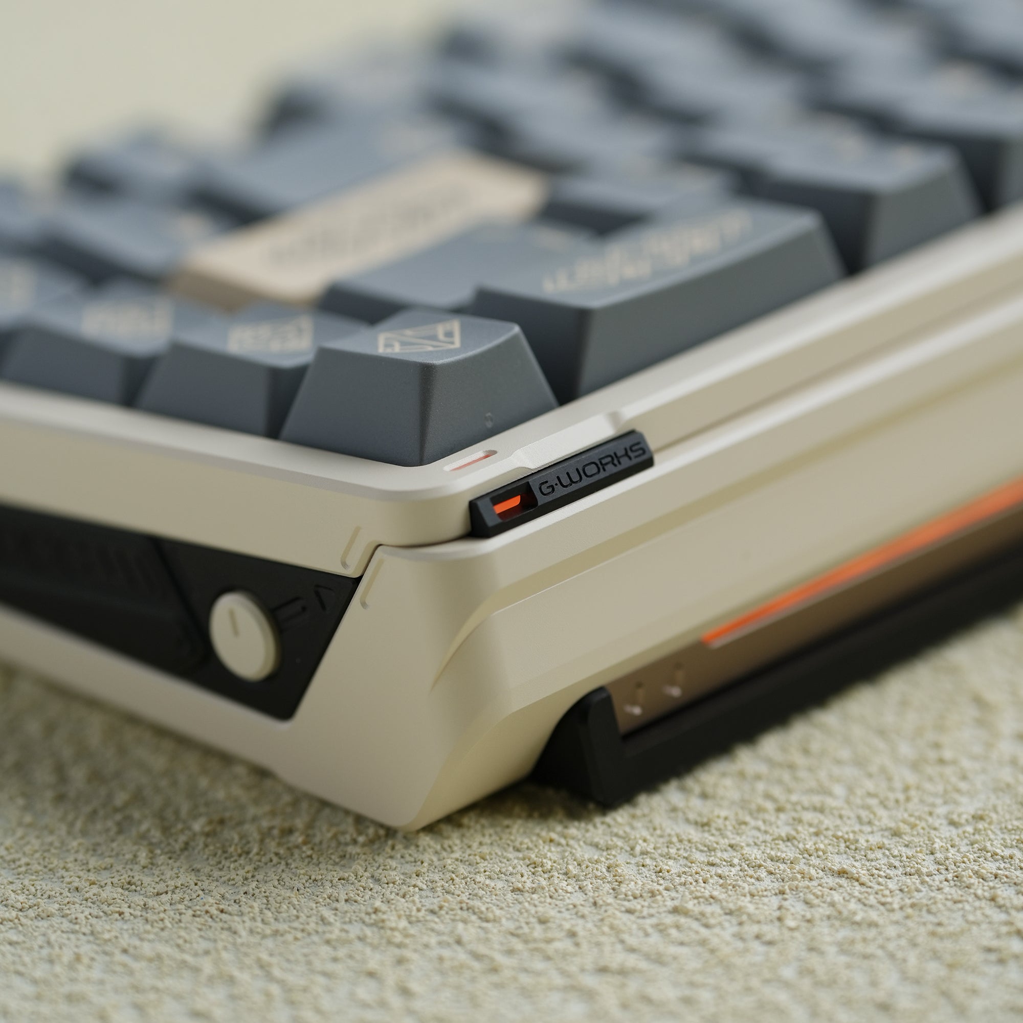
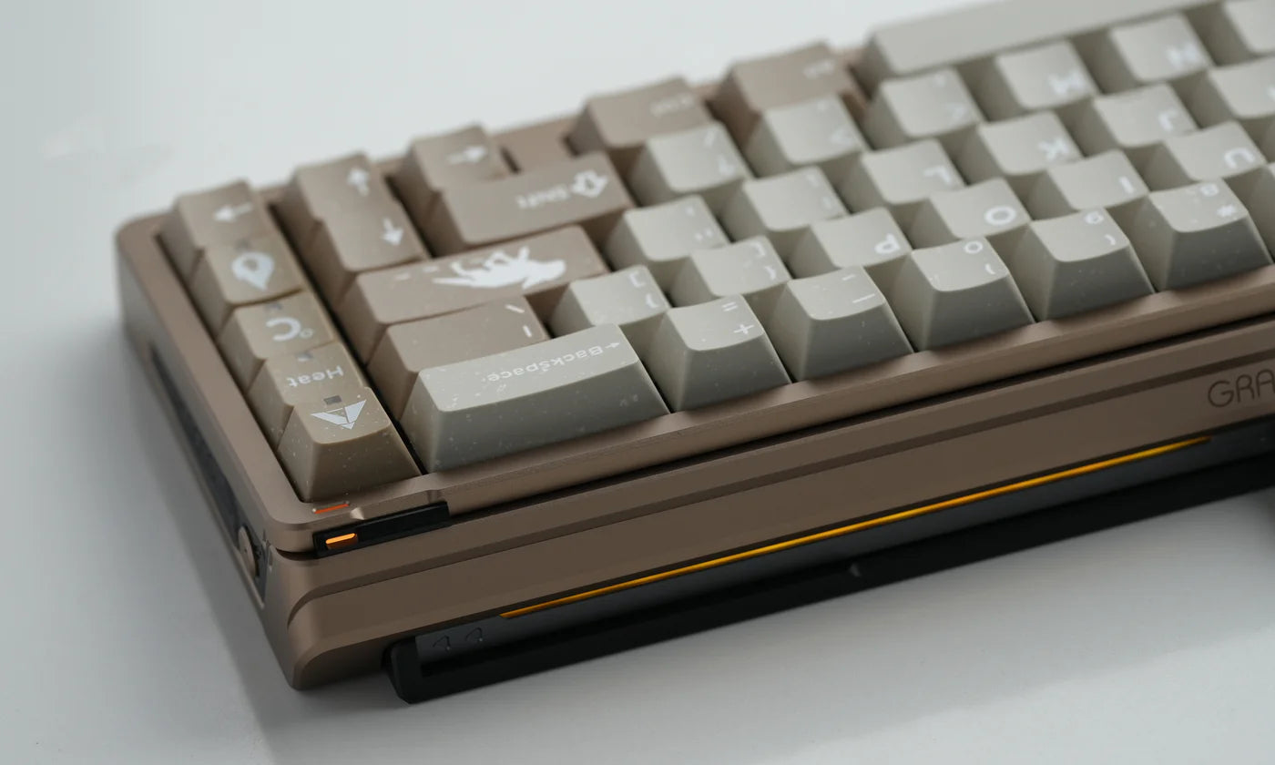
This time we are announcing a new off-the-shelf product line: G·WORKS .
In this new series, Gray Studio played with more styles of appearance design and experimented more structural treatments.
Here is an introduction to the second work in the series: Macross 65.